
Cart
Total: $ 0.00
Taxes and shipping calculated at checkout


Color plays a significant role in influencing our mood, emotions, and even behavior. When it comes to home decor, understanding color psychology can help you create spaces that are not only beautiful but also emotionally supportive.
From calming blues to energizing yellows, the colors you choose for your pillows, throws, and other decor elements can have a profound impact on how you and your guests feel in your home. This guide explores the role of color psychology in home decor and provides tips on selecting pillows and throws to enhance mood and create the desired atmosphere in your living space.
Color psychology is the study of how colors affect human emotions and behaviors. Each color has its own set of associations and can evoke specific feelings. By understanding these associations, you can use colors strategically in your home to create different moods in each room.
Red is a bold and powerful color that can stimulate energy and excitement. It’s an excellent choice for areas where you want to encourage lively conversation and interaction, such as living rooms or dining areas. However, because red can also increase feelings of anxiety or agitation, it’s best used as an accent rather than a dominant color.
Decor Tip: Use red throw pillows or a patterned throw with hints of red on neutral-colored furniture to create a vibrant focal point without overwhelming the space.
Blue is known for its calming and serene qualities, making it perfect for bedrooms and bathrooms where relaxation is a priority. Light blues can open up a space, giving it an airy feel, while deeper blues add a sense of coziness and security.
Decor Tip: Incorporate blue through pillows in shades like soft sky blue or deep navy. Pair with white or beige throws to maintain a peaceful and balanced look.
Yellow is associated with happiness, warmth, and positivity. It can bring a sunny, cheerful vibe to spaces like kitchens or entryways. However, too much yellow can cause feelings of frustration, so it’s best used sparingly.
Decor Tip: Add yellow throw pillows or a bright, cheerful throw blanket to a neutral sofa for a pop of color that instantly lifts the mood of the room.
Green represents nature and is associated with feelings of balance, harmony, and renewal. It’s a versatile color that works well in almost any room, from living areas to bathrooms. Green’s calming effects make it a great choice for spaces where you want to unwind and recharge.
Decor Tip: Mix and match green pillows in varying shades and textures, such as emerald velvet or soft sage cotton. Pair these with a neutral throw to create a balanced and inviting look.
Purple combines the calm stability of blue and the energy of red. It’s often associated with luxury, creativity, and spirituality. Light purples, like lavender, can evoke a sense of tranquility, while deeper shades like plum can add a touch of drama and sophistication.
Decor Tip: Use purple pillows to add a regal touch to your decor. Pair with gold or cream accents to amplify the sense of luxury.
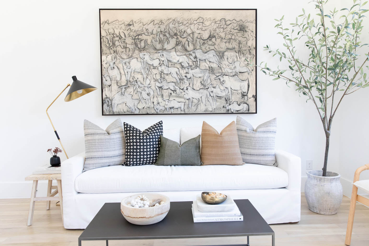
Gray is a sophisticated and versatile color that serves as a great backdrop for other colors. It’s neutral and can evoke a sense of calm and stability. However, too much gray can feel dull or depressing, so it’s best paired with more vibrant colors.
Decor Tip: Gray pillows with subtle patterns or textures can add depth to your seating area. Combine with throws in brighter colors like mustard or teal to prevent the space from feeling too cold.
Orange is energetic and warm, evoking feelings of enthusiasm and excitement. It’s a great choice for gathering spaces like living rooms or kitchens, as it encourages social interaction. However, like red, it’s best used as an accent.
Decor Tip: Add a burnt orange throw blanket or terracotta-colored pillows to your sofa to create a warm, inviting atmosphere.
White symbolizes purity, simplicity, and cleanliness. It’s often used to create a sense of space and openness. White is ideal for small rooms or those that lack natural light, as it reflects light and can make spaces feel larger.
Decor Tip: Use white pillows with subtle textures or patterns to add interest without overwhelming the room. Pair with a pastel throw to maintain a light and airy feel.
Before selecting pillows and throws, consider the purpose of the room and the mood you want to create. For instance, a bedroom should feel restful and serene, while a living room might be more vibrant and social.
Using multiple colors in your pillows and throws can create a dynamic and visually appealing space. Balance is key—pair warm and cool colors to avoid overstimulation or underwhelming decor. For example, pair a bold red pillow with a calming blue throw to balance energy and relaxation.
Layering pillows and throws not only adds physical comfort but also visual interest. Choose a variety of textures, such as knitted throws, velvet pillows, and woven fabrics, to create a cozy and inviting look. Layering different textures can also help to soften the impact of strong colors, making them more approachable.
Patterns can greatly influence the mood of a room. Geometric patterns can add a sense of order and structure, while floral or organic designs bring a sense of whimsy and softness. When working with bold patterns, consider keeping the color palette consistent to maintain harmony.
Decor Tip: A patterned throw with a subtle color palette can tie together various elements in a room and create a cohesive look.
Color can also be used to reflect the seasons, enhancing the mood of your home throughout the year. In spring and summer, opt for lighter, brighter colors that evoke freshness and vitality. In fall and winter, switch to deeper, warmer tones that create a sense of coziness and warmth.
Decor Tip: Swap out light blue and pastel pink pillows for rich burgundy or forest green ones as the seasons change to keep your space feeling current and comfortable.
For a lively and welcoming living room, consider using a mix of warm colors like yellows and oranges with cooler shades like blues or greens to balance energy and calm. A vibrant patterned throw can serve as a centerpiece, complemented by solid-colored pillows in coordinating hues.
In the bedroom, aim for tranquility and restfulness. Stick to cool colors like soft blues, greens, or muted purples. Layer throws in soothing textures like knitted wool or cashmere. The combination of calm colors and cozy textures will create a serene retreat.
For a productive home office, consider colors that promote focus and creativity, such as greens, blues, or even a touch of yellow for an energy boost. Avoid overly stimulating colors like red, which might be distracting. Incorporate a mix of textures and patterns that are visually interesting yet not overwhelming.
The dining area is a place for gathering and conversation. Use warm, inviting colors like reds, oranges, and yellows in moderation to encourage a lively atmosphere. Soft throws over dining chairs can add a touch of comfort and elegance.
Color psychology is a powerful tool in home decor, allowing you to influence the mood and feel of your space through thoughtful choices in pillows and throws. By understanding how different colors affect emotions, you can create environments that not only look beautiful but also support the mood and activities intended for each room.
Whether you’re aiming for a tranquil bedroom, an energetic living space, or a balanced home office, the right color choices can make all the difference. Experiment with colors, textures, and patterns to find the perfect combination that enhances your home and makes it a true reflection of your personal style.
Looking for comfortable and stylish pillows and furniture for your home? Look no further than our website! We offer a wide range of high-quality options to fit any taste and budget. From cozy throw pillows to plush sofas and chairs, we have everything you need to create a comfortable and inviting living space. Shop our selection today and give your home the upgrade it deserves!


